H's, L's & Isobars
Every weather map starts with pressure. A quick recap before we get to the more advanced symbols.
High Pressure
Marked with a blue "H" on most maps. Air sinks and spreads out, generally bringing fair, sunny weather.
Low Pressure
Marked with a red "L" on most maps. Air rises and cools, generally bringing clouds, wind, and precipitation.
➰ Circling the Center: Isobars
Weather maps also draw curved lines called isobars, connecting places with equal air pressure. When isobars are packed tightly together around an H or L, pressure is changing quickly over a short distance — meaning stronger wind. When they're spread far apart, pressure changes gradually and winds stay light. (We cover this in more depth on our Air Pressure & Wind page.)
The Fronts Explorer
A front is the boundary between two air masses of different temperature. Pick a type below to see how it behaves — and its official map symbol.
Cold Front
Map Symbols Reference
The exact symbols you'll see on a real weather map.
High Pressure
Blue letter H. Marks the center of a high-pressure system — usually fair weather.
Low Pressure
Red letter L. Marks the center of a low-pressure system — usually clouds or storms.
Cold Front
Blue line with solid triangles pointing the direction it's moving. Brings sudden, often intense weather.
Warm Front
Red line with solid half-circles pointing the direction it's moving. Brings milder, longer-lasting rain.
Stationary Front
Alternating triangles and half-circles on opposite sides — two air masses that have stopped advancing.
Occluded Front
Purple line with alternating triangles and half-circles on the same side — a mix of cold and warm front weather.
See It on a Real Map
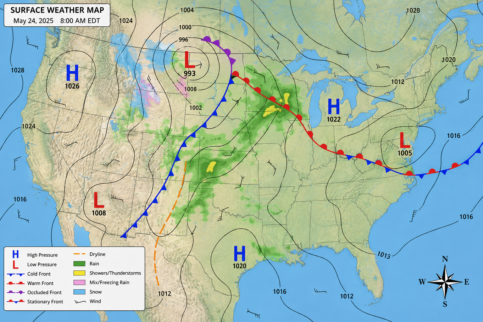
Real weather maps combine all of these symbols at once. Can you spot the H, the L, the cold front, the warm front, and the occluded front on this sample map? You'll also see curvy isobars connecting areas of equal pressure, and a dashed orange line called a dryline — a boundary between moist and dry air, common in the Great Plains.
Reading Radar Maps
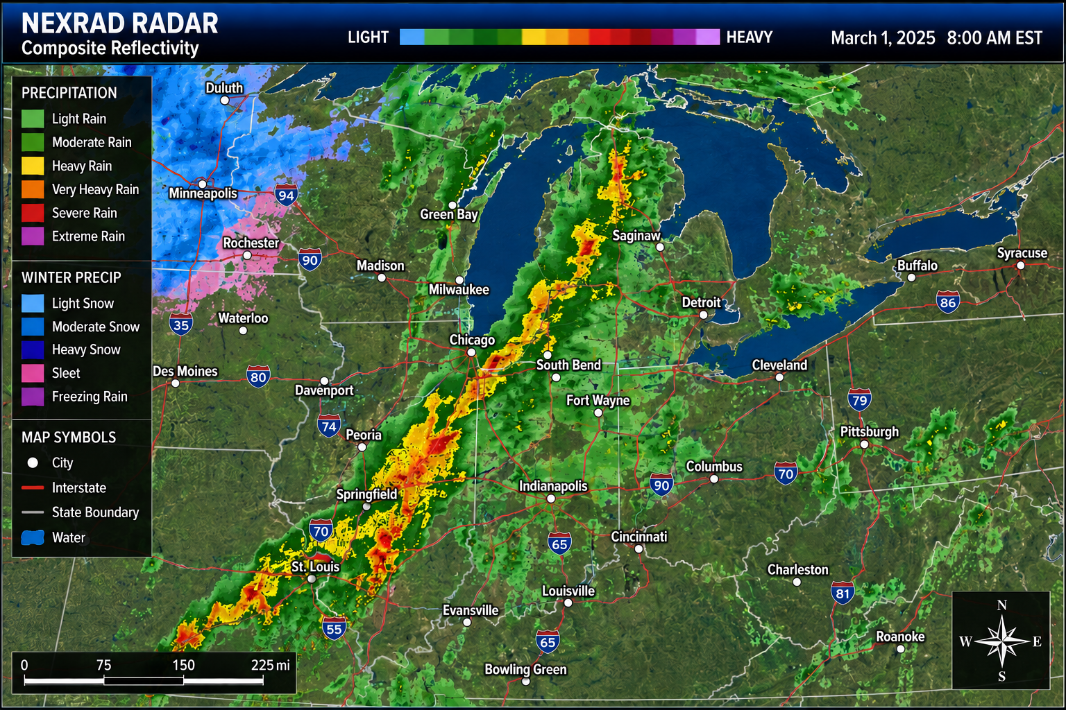
A weather map shows the big picture — fronts and pressure systems. A radar map shows something different: exactly where precipitation is falling right now, and how intense it is.
📡 How Radar Works
Weather radar works by sending out pulses of radio waves and measuring how much bounces back after hitting raindrops, snowflakes, or hail — meteorologists call this "reflectivity." The more that bounces back, the more intense the precipitation. Computers translate that signal into the color-coded maps you see on the news, often called NEXRAD (Next Generation Radar) composite reflectivity maps.
Rain Intensity
Winter Precipitation
🆚 Radar Map vs. Weather Map
A surface weather map updates a few times a day and shows the big picture — where air masses and fronts are, and why weather is happening. A radar map updates every few minutes and shows exactly where precipitation is falling right now, which makes it perfect for tracking a storm as it moves toward you.
Did You Know?
A few surprising facts about weather maps and fronts.
The word "front" comes from World War I. Norwegian scientists who developed modern front theory pictured clashing air masses like armies meeting along a battle line.
Cold fronts usually move faster than warm fronts — part of why cold-front weather often arrives suddenly and clears out quickly, while warm-front weather tends to linger.
An occluded front happens when a fast-moving cold front catches up to a slower warm front ahead of it, lifting the warm air completely off the ground.
The National Weather Service publishes official surface weather maps online with fronts, pressure systems, and isobars marked in detail — the same kind of map professional forecasters use.
Test Your Knowledge
Answer these 4 questions. Get 3 or more correct to master this lesson!